a common mistakes I see clients make when commissioning architectural visualization is defaulting to photorealistic renders for every stage of the design process. The instinct makes sense — photorealistic output looks impressive — but it often creates problems. Hyper-detailed renders of an early-stage design lock in decisions that haven't been made yet, generate client feedback about finishes when what you actually need is feedback on massing, and cost significantly more than what the project phase actually requires.
The architectural rendering styles available today span a wide range: photorealistic CGI, watercolor and soft wash, technical line drawings, white-box and clay models, stylized collage, and hand-rendered sketch aesthetics. Each style communicates something different, signals a different level of design resolution, and triggers a different type of response from whoever is reviewing the work.
This guide covers the six most useful architectural rendering styles — what they are, when they're appropriate, what they cost, and what distinguishes a professional execution of each from a generic one.
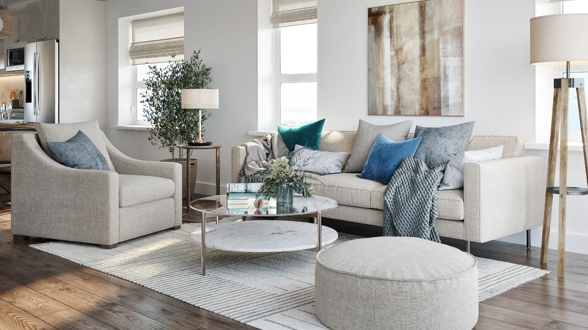
Photorealistic Rendering: The Gold Standard for Final Presentations
Photorealistic architectural rendering is the style most people think of when they hear "3D rendering." Built on physically based rendering (PBR) workflows — where materials, lighting, and camera settings simulate real-world physics — photorealistic renders are designed to be indistinguishable from photography. Brick reads as brick. Glass reflects accurately. Shadow falls at the right angle for the time of day and site latitude.
This style is appropriate when the design is resolved enough to show it honestly. For exterior renders, that means finalized cladding materials, window sizing, and landscaping intent. For interiors, it means confirmed flooring, cabinetry finishes, furniture, and lighting layout. Photorealistic renders created before these decisions are made will either look unconvincing or lock in choices that need to remain flexible.
In my experience, photorealistic rendering delivers the best return on investment at three specific project moments: investor or lender presentations, planning and permit submissions, and marketing campaigns. In all three cases, the audience is evaluating the project as a final outcome — they need to see what it will actually look like, not a design in progress. This is also the style used for pre-sales websites, brochures, and hoarding graphics.
Photorealistic exterior renders typically take 4–7 business days per image. Interior renders run 5–8 days depending on complexity. For a full marketing package across a mid-size development, budget 3–4 weeks from brief to final delivery.
White-Box and Clay Rendering: For Massing and Spatial Studies
White-box rendering — also called clay rendering or grey-box rendering — strips away all material and texture information, presenting the building as a uniform matte surface. Everything reads as the same color and material, which focuses the viewer entirely on form, proportion, volume, and spatial organization.
This style is most valuable at the schematic design phase. When a design team is still resolving massing, comparing building envelope options, or reviewing spatial proportions, a clay render communicates the decision that actually needs to be made — does this form work? — without introducing noise from material choices that haven't been finalized. It's also significantly faster and less expensive to produce than a photorealistic render, because the studio doesn't need material specifications or finish schedules.
Architects and planning consultants use white-box renders for design review meetings where the question is always "does the mass work?" rather than "do I like the brick color?" Planning departments in California increasingly accept clay-model renders as part of preliminary design review submissions, which makes this style useful for early community engagement and pre-application meetings as well.
One variant worth knowing: the grey-box render adds very subtle material differentiation — showing glass openings as darker surfaces while keeping walls uniformly light — which helps communicate the building's transparency without committing to final facade specifications. This works well for schematic-phase client presentations where stakeholders need a bit more visual legibility than a pure white-box provides.
White-box and clay renders cost 40–60% less than full photorealistic output for the same scene complexity. For an article specifically covering this style in depth, see our guide to white-box rendering in architecture.
Watercolor Rendering: The Concept Communication Tool
Watercolor architectural rendering — whether produced digitally from a 3D base or hand-rendered — uses soft washes, visible brushwork, and impressionistic textures to communicate design intent without claiming photographic precision. The defining characteristic of a good watercolor render is that it shows clearly what the design is about while visually signaling that the design is still a proposal, not a finished specification.
This distinction matters more than it might seem. When an architect shows a photorealistic render of an early concept, clients often respond by interrogating specific details — the exact shade of brick, whether the window grilles are right, whether the plants are the correct species. Those aren't the conversations you want to have at concept stage. A watercolor render redirects attention to what matters at that phase: the compositional idea, the character of the space, the relationship between building and context.
Watercolor rendering is particularly effective for competition submissions, where the goal is to convey a design philosophy as much as a literal building. It's also used frequently for planning submissions in historic districts and sensitive contexts, where planning departments and heritage boards respond better to designs presented with a degree of artistic deference rather than assertive photorealism. Los Angeles has several HPOZs (Historic Preservation Overlay Zones) where this approach is especially appropriate.
From a production standpoint, professional watercolor rendering is a post-production technique applied to a 3D base: the studio renders a white-box or basic photorealistic pass, then applies layered painterly effects in Photoshop or equivalent tools. A skilled execution takes as long as a photorealistic render — roughly 3–5 days per image — because the post-production artistry requires significant manual work.
Sketch and Line Rendering: Rough, Fast, Flexible
Sketch-style rendering — hand-drawn or digitally rendered to look hand-drawn — is the loosest and most communication-efficient style. It signals: this is an idea, not a commitment. Lines are visible. Shadows are gestural. The image looks like something produced in an afternoon design session, which is often exactly the message it needs to send.
The practical use cases for sketch rendering are concept-phase internal reviews, early client workshops, and feasibility studies. When a project is at the stage of evaluating whether a massing approach makes sense before investing in detailed design development, sketch renders allow teams to visualize and compare options quickly without building the 3D fidelity that a photorealistic render requires.
Sketch rendering is also used in certain types of design presentations where a polished CGI image would feel tonally wrong — community engagement meetings for sensitive projects, academic design reviews, or exhibition materials where the goal is to show process rather than outcome. There's a communicative integrity to presenting a conceptual design as a sketch rather than as a finished photorealistic render that doesn't yet accurately represent the building.
In terms of production, sketch-style rendering is the fastest option. Studios typically produce sketch visualizations in 1–3 days per image because the output standard is intentionally imprecise. For rapid options studies — comparing 3 or 4 massing schemes — sketch rendering offers the best speed-to-clarity ratio of any visualization style.
CGI Collage Rendering: Mood, Atmosphere, and Brand
CGI collage rendering blends a 3D-rendered base with photographic cut-out elements — people, plants, texture overlays, sky replacements, and contextual photography — to create images that feel more like design illustrations than building photographs. The result is something between a photorealistic render and a graphic design artifact: more immediate than a sketch, more editorial than a pure CGI render.
This style is used most effectively for early marketing materials, design competition submissions, and presentations where capturing the mood or lifestyle of a project is as important as communicating its literal appearance. For residential developments — particularly high-end projects where the buyer is purchasing a lifestyle, not just a unit — collage renders can communicate character and emotional resonance more effectively than technically perfect photorealism.
Collage rendering also allows studios to establish a visual identity for a project early, before material specifications are complete, by using photographic textures rather than fully specified 3D materials. This is useful when a developer needs marketing imagery for a project website or pre-sales campaign before design development is complete.
Style Comparison at a Glance
The table below summarizes when each style is appropriate, the typical production time, and relative cost compared to a standard photorealistic exterior render.
| Style | Best For | Project Phase | Timeline | Relative Cost |
|---|---|---|---|---|
| Photorealistic | Marketing, investor pitches, permit submissions | DD → CDs → Construction | 4–8 days/image | Baseline (100%) |
| White-box / Clay | Massing studies, form review, early planning | Schematic Design | 2–4 days/image | 40–60% of baseline |
| Watercolor | Concept presentations, competitions, historic contexts | Concept → SD | 3–5 days/image | 70–90% of baseline |
| Sketch / Line | Options studies, feasibility, internal reviews | Concept | 1–3 days/image | 30–50% of baseline |
| CGI Collage | Early marketing, brand/mood, lifestyle campaigns | SD → DD | 3–5 days/image | 60–80% of baseline |
| Stylized / Artistic | Competitions, editorial, architectural illustration | Any | 4–7 days/image | 80–120% of baseline |
How to Choose the Right Style for Your Project
The decision framework I use when briefing a rendering style has three variables: design resolution, audience type, and communication goal.
Design resolution is the most important. If your drawings still have unresolved areas — materials yet to be specified, unit layouts still in flux, exterior elevations not finalized — a photorealistic render will require the studio to make assumptions about those areas, and those assumptions will show up in the render. When the client or board inevitably reacts to those assumed choices, you'll be defending decisions that aren't actually yours. Use white-box or watercolor styles until the design is ready to be represented with precision.
Audience type shapes the appropriate visual register. Investors evaluating financial feasibility respond to clear, legible photorealism that lets them visualize the exit product. Planning boards in sensitive neighborhoods respond better to watercolor or sketch presentations that communicate deference to context. Community engagement meetings benefit from approachable, non-threatening imagery — collage and soft-wash styles work well here because they feel inclusive rather than authoritative.
Communication goal determines whether you want the viewer focused on the building's form, its atmosphere, or its precise material character. Massing review: white-box. Mood and lifestyle: collage. Final appearance: photorealistic. Conceptual intent: watercolor or sketch.
In practice, the most effective visualization strategies use multiple styles across a project's lifecycle — concept sketches or watercolors for early design development and community engagement, white-box renders for planning pre-application meetings, and photorealistic renders for investor decks and marketing. Many studios offer bundled pricing across styles when briefed for the full project lifecycle.
What to Brief the Studio on When Specifying Style
When requesting a specific rendering style, the brief should go beyond just naming the style. For any non-photorealistic render, include:
- Reference images showing the visual aesthetic you're targeting — not just the building type but the specific rendering treatment you want
- The intended audience and use case — this helps the studio calibrate how loose or structured the output should be
- The level of material specification included in your drawings — if finishes are unresolved, say so, and brief the studio on how to handle those areas
- Whether the images need to work at full resolution or only at screen resolution — this affects the production pipeline and delivery format
For photorealistic renders, a full material schedule and reference imagery for every major finish is essential. For white-box renders, a massing model and site plan is typically sufficient. Our guide on how to brief a rendering studio covers what to prepare at each project stage.
Our exterior rendering and interior rendering services are available across photorealistic, white-box, and artistic styles. For full pricing across styles, see our pricing page or contact us for a project-specific estimate — we'll recommend the right style combination for your current design stage and timeline.
For further context on the full spectrum of photorealistic output quality and technique, see our article on photorealistic rendering explained. For how rendering style decisions play into selling your design to clients, see our guide on how to sell design projects faster with visualization.
Not Sure Which Style Fits Your Project?
Share your drawings and tell us where you are in the design process — we'll recommend the right style and deliver a scoped estimate within 2 hours.
Get a Style Recommendation